I knew when I saw these pictures, that I had the inspiration for my challenge piece.
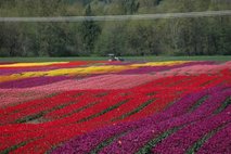

Because I am not gifted in art quilts or free form / original design, I needed a pattern that could be pieced simply. I chose the rail fence design. I can see ribbons of colour in the fields of tulips in the photo. I have tried to duplicate what I saw in the photo into the design of my quilt.
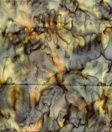
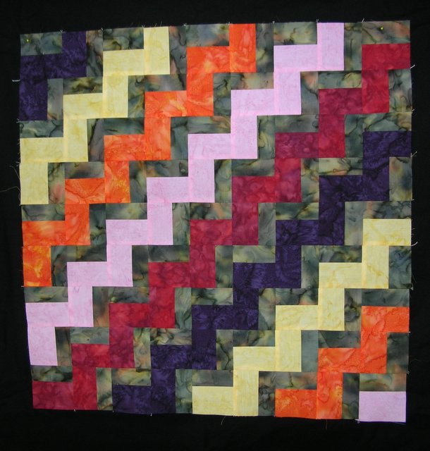
I am now at the stage where I must decide on a border treatment. The photo below is my quilt so far--it is the centre of the quilt. Please ignore the black surrounding the piece--this is not a border. I took the photo against a black piece of fabric. The dark zig zag next to the red zig zag looks black, but is actually deep purple. There is no black on this quilt so far.
Do you have any suggestions for borders?

I really like that red in the centre stripe. What if you were to do a piano key border with the various colours?
ReplyDeleteI think it could look cool with a black border. Maybe quiltpixie's piano keys and a think black border inside them?
ReplyDeleteOr that gray blue that's in the print - to simulate the sky? This is very effective. Do you get to show your inspiration piece with your quilt?
ReplyDeleteIt is great! I hope you get to hang the photo from where your inspiration came because you really can "see" it!
ReplyDeleteI always get hung up on borders... but maybe one of the brighter colors (skinny) followed by a darker color (wide) - that is usually my method.
Cheers!
Evelyn
Actually how about a small bit of black and then out to something brighter--the red? It does have to live at your house after the challenge so something that will go with your house, anyway.
ReplyDeleteWow-perfect design choice for your inspiration. Love the challenge fabric,too.
ReplyDeleteVery geometric - a wonderful representation of the fields of tulips! The one fabric does look like a deep purple on my screen. But I'm like you - no idea at all for a border. I'm no help!
ReplyDeleteI got your "package" in the mail yesterday. Thanks so very much! I can hardly wait to take a look at the pictures.
Wow, great interpretaton! Sorry I'm no help with the border. A plain black border might just frame it - just not sure!
ReplyDeleteI love your quilt! It is a great interpretation! What about something with letters like Tonya does . . say something about the beauty of the Earth??
ReplyDeleteJudy L.
I'm not too good on design, but I like the piano key border. It seems like those pieces would be in keeping with what's happening in the center.
ReplyDeleteI grew up in an agricultural town with many flower fields. Often flowers could be found growing outside of the field from seed that blew in the wind.
It's a great top Norma, and your quilt idea lines up so well with the your "inspiration" source!
ReplyDeleteLove the colors you chose! Borders aren't my strong point either. I kine or eo like the black next to it..it stops things. I suppose it depends on how much work you want to do on this, and how much fabric you have left. I could see a border of rectangles going around..the length and height of the fence rail, seperated by the background color. Kind of a dots and dashes affect. But then I also thought of maybe quarter circles, or half circles using the drunkards path template? A curve might be nice out there...depends alot on fabic I think. Probably no help at all...LOL Hugs for what ever you decide, Finn
That is a great representation of the photo. Brilliant!!! I suck at borders, so I'll let others give you ideas.
ReplyDelete